BIZ-OMICS
Economics: Market Structure Visualizer Pack
Economics: Market Structure Visualizer Pack
Couldn't load pickup availability
This bundle brings together two interactive economics visualisers that let students explore and compare how firms behave under monopoly and perfect competition. Each tool provides dynamic diagrams, adjustable scenarios, and clear explanations to deepen understanding of market structures and their impacts.
The Monopoly Economics Visualiser
The Monopoly Economics Visualiser is designed to help learners understand how a firm with market power operates and the consequences this has for efficiency, pricing, and welfare. By allowing students to adjust demand, fixed costs, and variable costs, the tool makes abstract theory come alive through immediate visual feedback. Learners can see how the equilibrium point shifts when marginal revenue meets marginal cost and how supernormal profits are represented graphically. The inclusion of scenarios such as regulation and contestable markets adds an extra layer of application, enabling learners to examine the impact of policy intervention or the threat of competition. Used in a classroom, this visualiser can support teacher-led explanations, independent exploration, or group work, encouraging students to test hypotheses and see economic principles in action. The learning outcomes include a clear understanding of monopoly characteristics, the reasons why allocative and productive inefficiencies arise, and the ability to evaluate the welfare implications of monopoly power.
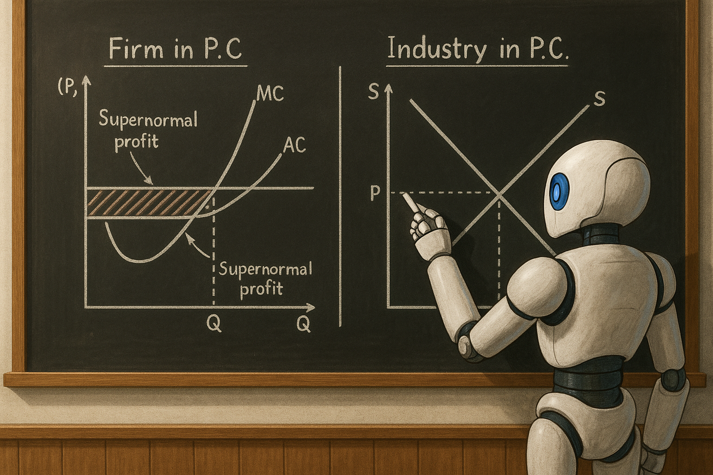
The Perfect Competition Visualiser
The Perfect Competition Visualiser focuses on the opposite end of the market spectrum, helping learners grasp how firms behave when there are many sellers, identical products, and no barriers to entry. Students can toggle between short-run and long-run scenarios, including normal profit, supernormal profit, and shutdown conditions. The interactive curves highlight the relationships between price, marginal cost, average cost, and average variable cost, showing how equilibrium is reached and adjusted over time. The benefit of this tool is that it demonstrates concepts like long-run equilibrium, where firms make only normal profits, in a way that is far easier to comprehend than static diagrams in a textbook. In teaching contexts, it can be used to compare theory with real-world examples of competitive industries, or as a formative assessment tool where students predict outcomes before testing them. The key learning outcomes are an ability to explain why firms in perfect competition are price takers, how profits act as signals for entry and exit, and why long-run equilibrium results in allocative and productive efficiency.
Together, these visualisers not only reinforce theoretical knowledge but also develop analytical and evaluative skills by encouraging learners to manipulate variables, interpret diagrams, and apply their understanding to different market conditions.
Share